Mar 12, 2014
The Warner Brothers Logo – 90 Years of Metamorphosis
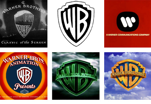
What makes a logo timeless? That was one of the first things that came to mind when I saw the array of logos that Warner Brothers has brandished over the last 90 years. The logo has taken some radical swings since it was first introduced in the 1920’s. The original logo was made up of the shield, a snapshot of the original studio and the Warner Brothers initials. Since then they’ve dropped the shield, brought it back, made the logo’s initials super abstract with the version created by Saul Bass in the 1970’s, they’ve gone from a really ornate logo to 3d to flat and modern. You can view most of the logos via this great post by Christian Annyas. He has an incredible collection of the logos which took him 5 years to collect.
His on-pager gives us a great snapshot of the various swings in design that the logo has taken over the years. For what it’s worth, the shield and initials have stood the test of time. I think that’s a fraction of what makes this logo timeless.
So I guess the post is a combination of 2 things. It’s not only a snapshot of all of the beautiful variations of the logo and how the shield and initials have remained core, it also asks what, in fact, defines a timeless design? The term fascinates me. When we apply timeless to design, what defines that? How do you know a design is timeless? Who decides? Sure you can stick with design fundamentals, create something beautiful, and have a client gush over it but I think that’s just scraping the surface. My theory is this: no one has a recipe for timeless design. It’s a combination of good design, brand successes and it’s audience.
#logodesign #warnerbros #brand #logo