Oct 09, 2014
The ello Design & User Experience—Haters Gonna Hate

First, let me say that I have no reason to like or dislike the new social app ello. Also I’m not a habitual user of Twitter or Facebook.
Here’s the deal, for those of you who don’t know, ello has been making an abundance of noise as of late. It’s a new social media platform similar to Facebook and although it’s not ello’s goal, some have said it’s the new “Facebook killer”. Last week I received an invite from ello and as a fellow designer I felt obligated to give it a spin; with all of the hype, I was pretty anxious to sign up. Here are my initial impressions:
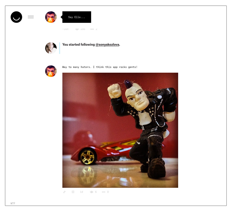
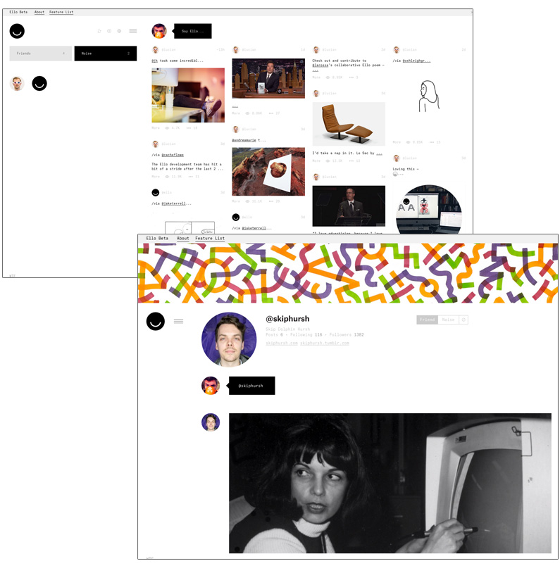
- It is easy to get started. A little “hipster-minimal” looking but in a mater of seconds I was adding friends, posts and images. Impressive.
- The design is utilitarian and all or most of the elements serve a function
- Fonts: I didn’t quite get the various sizes and faces. It doesn’t feel hierarchical or cohesive.
- I think they could work a bit on contrast and hierarchy. Some of the text/buttons are difficult to read.
Overall, it feels a little cold but cool. It feels like it caters to anti-establishment types which does align with their mantra. Is it a Facebook killer?, no but I do think it’s a rock-solid beta and obviously they are getting a ton of press. I’m happy for them. So why all the haters?
Sadly when searching for ello much of the noise is negative, in fact one of the more popular posts, “Ello: a design disaster” via Medium, is ridiculous nonsense, especially coming from someone who obviously doesn’t understand our counter-culture. From what I can tell, he’s a video game designer and not very good at it. Even Fast Company sourced the article and supported it. Dumb.
I don’t agree with most of the things in this article. I find it kind of hater. Is there anything in doing something new? They already said they don’t want to be the next Facebook if I didn’t misunderstood. ALEX.CANADA via Fastcodesign.com
For a first pass, I think ello rocks. It needs some work but it functions well and I was up to speed in seconds. Here are couple more post-worthy opinions:
Without entering into the merit of the user to be a product, Facebook is chaos. It took only ten minutes to learn to use Ello. How long can a person who has never accessed the Facebook would take to learn? Sorry, but I only see a text that proposes to attack the weak points without highlighting the positives. JULIO LIMA – Via Fastcodesign.com
I like the “WTF” for a FAQ and “Shit happens” for a missing password is awesome. If those types of things bother you or offend you for some reason, just stick to facebook… we dont want stuffy white guys around us anyways. Jean-Luc Rivard via Medium
Don’t judge, give ello a spin. You can follow me there @vinced. If you can’t get an invite message me and maybe I’ll hook you up!