Apr 03, 2015
Tidal’s Controversial User Experience and Interface Design
If you didn’t’ catch wind of the Tidal launch this week you must’ve been poppin’ Ambiens. Tidal, a subscription music service acquired by Jay Z, launched on Monday. Along with Jay Z the announcement was made by an array of iconic musicians and backers. The launch has been a shit-storm of marketing genius. It’s definitely got people talking and that’s the objective right?
As a huge music fan I WANT TIDAL TO SUCEED. I think most of the top music apps like iTunes and Spotify are awful. The user experience is weak. The way they handle local music (on your machine) is crap and they haven’t really managed to capture the magic of discovery. Oh and not to mention the artists. For the most part they get the short end of the stick—companies make millions off of streaming services and the artist gets zilch. Tidal’s mission is to fix that.
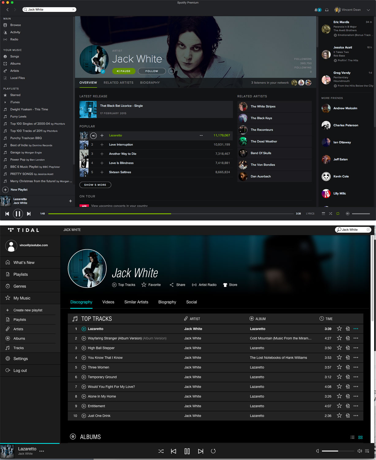
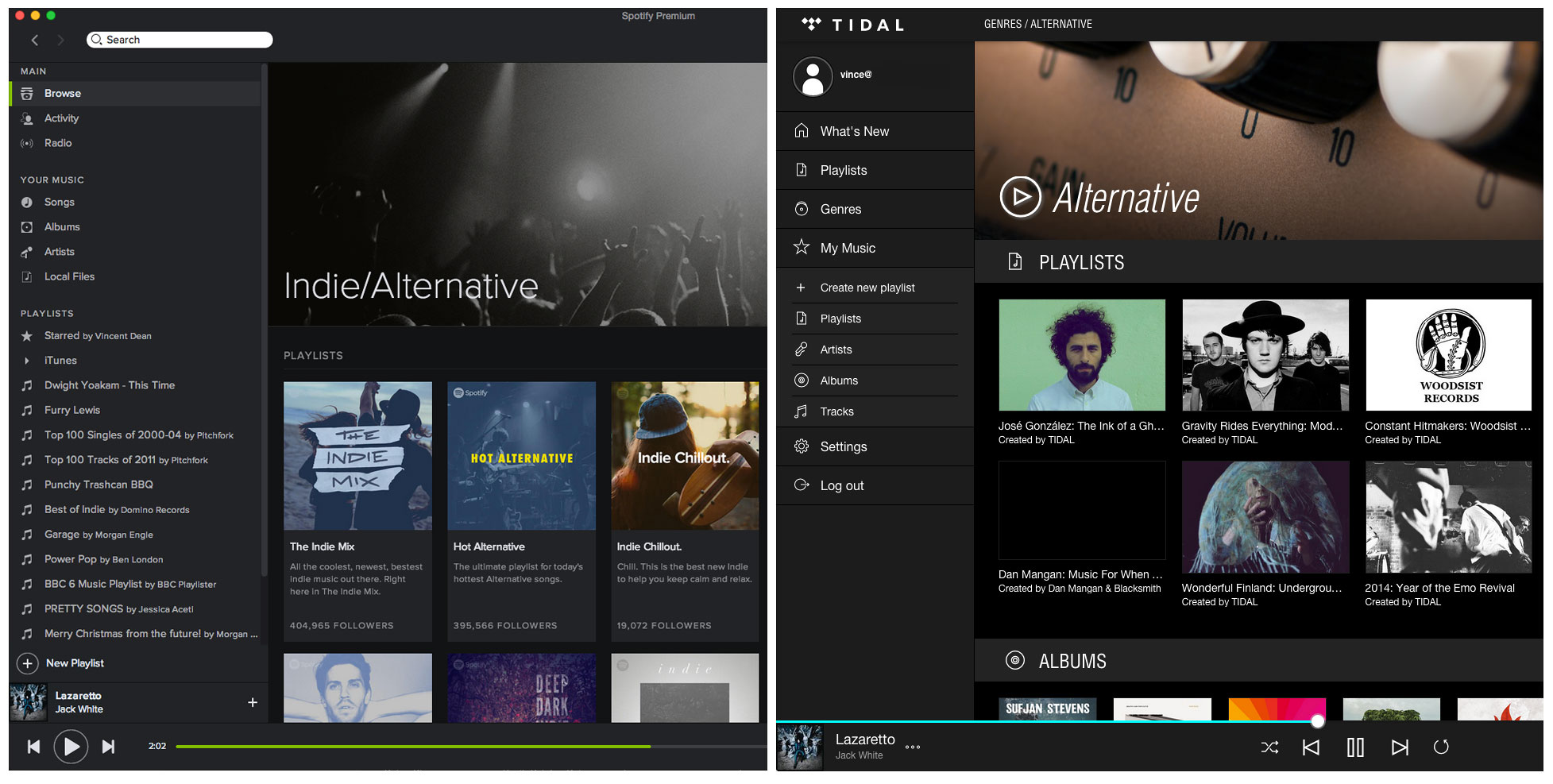
On a not-so-good note, the new app looks a lot like Spotify and the design community is talking. I was a bit skeptical but I installed Tidal today. The results were not good. Sure the layout arrangement of the navigation items, artists, playlists, etc. make hierarchical sense but it’s way too close not to argue. Being inspired by design is one thing but stealing design is another. I wanted to be wrong but after installing and using both apps it’s apparent that way too many ideas were lifted. I hate that. Hopefully they fix it. Lord knows they can afford it. Oh and I really do like Jay Z.
Related Articles:
Jay Z Reveals Plans for Tidal, a Streaming Music Service
Spotify v Tidal. BUT who ripped who off?
The Full Transcript Of Jay Z’s Tidal Q&A At The Clive Davis Institute Of Recorded Music
Jay Z’s Tidal Claims To Respect Artists, But Rips Off Spotify’s Design
Tidal Addresses the Backlash: ‘There’s So Much More to Do’