Jul 23, 2015
The Metro Logo—Infinite Design Possibilities
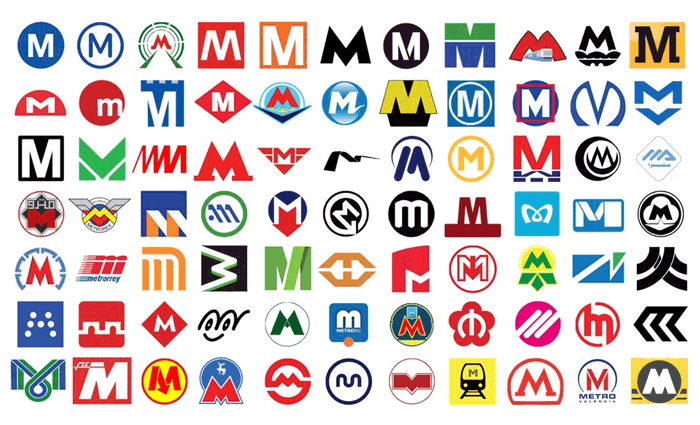
Metro is the de-facto identity for public transportation across the globe. From Paris to Tokyo to Baltimore all have unique logos made up from the letter M.
Eric Jaffe at City Lab recently posted an in-depth article on metro logos across the world. The post 77 Ways to Design the Letter ‘M’ is a glowing testament to the diversity and potential of design. With 77 logo examples, the article elaborates on a handful of marks by explaining the concepts surrounding each.
“It’s no accident, for instance, that the Tokyo Metro M loops toward closure at the bottom, as if trying to form a heart. The agency says the design “reminds us that we serve the heart of Tokyo with thoughtful, heartfelt service.” Michael Beirut of Pentagram goes on to say as a graphic designer he “really likes that sort of thing”—the extra step that makes a logo memorable.”
With upwards of 100 mass transit systems across the globe how could each city create a unique mark made up of just 4 straight lines? Most would think we’d run out of ideas or even end up with duplicates but that’s not the case.
As a designer myself, I fully know that every letter in our alphabet has potential for thousands of simple yet unique identities.